Personalizing UI
When you think of personalization, the first thing that comes to mind is Amazon showing you products they think you will want to buy. If your work is proximal to tech, you already know that ads online, Google search results, the Facebook feed, etc. are all also personalized. Aside: if you are a tech Muggle, you probably don’t think of personalization at all, and these products are just seem very interesting and engaging!
Invariably, personalization is assumed to apply to content – products to buy, ads to click, posts to like, etc. The scaffolding around the content is ignored, and underestimated, when it comes to suiting individual preferences.
On mobile, where the battle for attention - a fleeting glance here and a casual swipe there - is more Darwinian than on the web, unnecessary taps or pauses are an evolutionary disadvantage for apps. I expect we will see apps starting to personalize their UI and make it more fluid.
While having UI be dynamic is more challenging, there are simple ways for interfaces to adapt to a user’s context.
Mobile games were perhaps the first to innovate in this area (as they are in most areas concerning consumer apps!) Starting with a dedicated first-time user experience (FTUE or ’efftooey’) that would run only for new users to introduce them to basic game elements, or have dedicated quests to help users navigate through different parts of the game. Non-game apps have started to take a leaf out of this book. Here are screenshots of the FTUE of a popular to-do app called Weave:
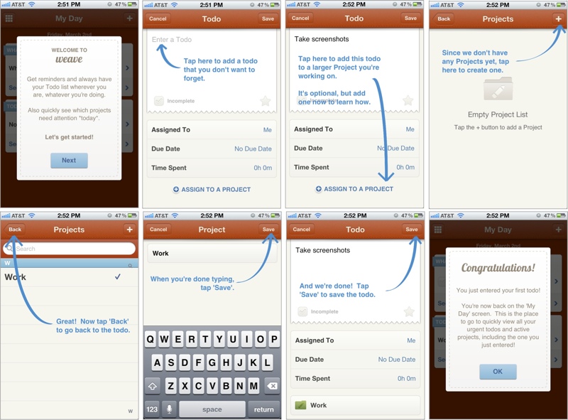
Onboarding flow of Weave (source)
Secret and Slack have recently received accolades for their FTUE too. Smashing Magazine has a really interesting guide to FTUEs on mobile.
Adapting UI to context is prevalent outside of FTUEs too:
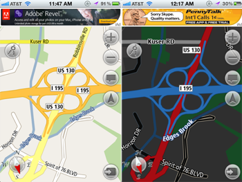
GPS app changing color schemes at night
- Screens on GPS devices switch to a darker color scheme at night, to reduce glare and distraction while driving.
- Language localization is perhaps one of the oldest forms of adapting the interface for the user.
- Responsive web pages are a great example of the UI adjusting automatically with the context being your screen size.
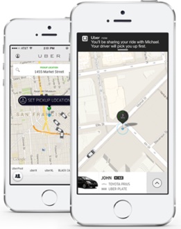
Uber’s default view changes
- The Uber app changes its default view depending on whether you are about to request a ride or have already requested a ride to show you relevant information accordingly.
- The new Foursquare app notifies you of interesting places around you, and the notification is triggered only when it sensess that your location has changed.
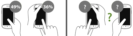
Hand postures when using a mobile device (source)
- Knowing that most users use only the thumb of their dominant hand to interact with an app, apps should structure their navigation accordingly, AND laterally invert key elements for left-handed users.
In contrast, desktop interfaces have the luxury of screen real estate and haven’t needed to innovate here. They often default to showing everything and the kitchen sink at the user.
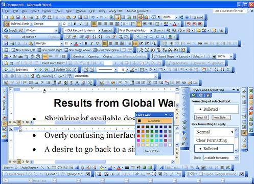
Microsoft Word on desktop with all menus enabled
Three key ingredients to consider while personalizing interfaces are Identity, Context and Behavior.
Identity: There are two parts to identity: the first is being able to recognize every user when they come back to your app, even on different devices. The second is knowing some profile information about the user – traits that let you tailor their experience: whether they are left or right-handed, languaage preferences, network bandwidth, etc.
Context: Context is about the here and now of a user using your app. If they are at home or elsewhere, sitting in a restaurant or walking on the street, whether they came to the app from a particular notification or opened it of their own accord.
Behavior: Interpreting a user’s previous actions to anticipate what they might do in the future is understanding their behavior. This is where personalization gets complex but also where the magic happens. For a calendaring app, is the user scheduling a business meeting or a blocking time for a personal task? For a payment app, is it being used to send money to a friend or pay a bill? For a news app, does this user often share articles they find interesting with their spouse?
However, there is a slippery slope to fluid UI. The best interfaces are the ones that feel familiar – when the user knows where to find things. Getting personalization wrong and not having a consistent familiarity can be the worst of both worlds.